But why create yet another wine brand? You might say that’s the basic question. Well, it’s true that we were both working in the wine industry (even if that’s not where we met, but at the Crossfit gym, for the record 🏋️), but we’d both already managed estates and created wines, so it wasn’t necessarily a goal in itself.
On the other hand, there was a passion for wine itself; for the stories it tells, for the whispers of the people who have shaped it and who we meet again when we taste it, and also for the faraway destinations it evokes. Each bottle is a journey, an adventure; it’s very much like the coloring Anna and I want to give to our life together. And I think that’s where the project really began: around this notion of togetherness, we wanted to create a brand that reflected us.
What’s more, we were familiar with the classics of wine, and we wanted to show another way of approaching this fascinating world, a vision that was just as qualitative but easier for consumers to grasp. We wanted to bring something fresh and new to the table.
In a previous article, I spoke to you about the choice of our brand name: JALAN and the notion of discovery and travel it conveys, of the path it represents in our lives and in the world of wine. Once we had created this base, we had to materialize it in a universe in order to apply it to our labels and our marketing tools.
In the world of wine, one of the only communication media is the label on the bottle. Given the number of product references in a wine shop, and the principle of segmentation by appellation, which creates strong umbrella brands, you have to succeed in creating a label that appeals when you see it on the shelf, that attracts attention, and a back label that arouses interest and curiosity when you read it. Afterwards, once the bottle has left the store and found itself on the table of one of our Jalanisés, we know the passion we’ve put into our wines, and we’re confident enough to imagine that you’ll be pleased with your choice to have seized this bottle from the shelf of your favorite wine shop.
So we knew we wanted to talk about travel and, another important thing, we wanted to be the brand’s ambassadors. The first challenge for a wine brand is to create trust. How many times have we stood in front of a shelf and thought: “What the hell do I know, who is this Tartempion knight and is it any good?” We had to be able to talk about Jalan and, at the same time, it had to be us, and Anna and I had to be the link of trust between our customers and our wines. The trust would come from our many years of experience working in the wine business, the many years of winemaking I’ve done, the blends we’ve created, our training and hundreds of bottles of wines tasted from all around the world.
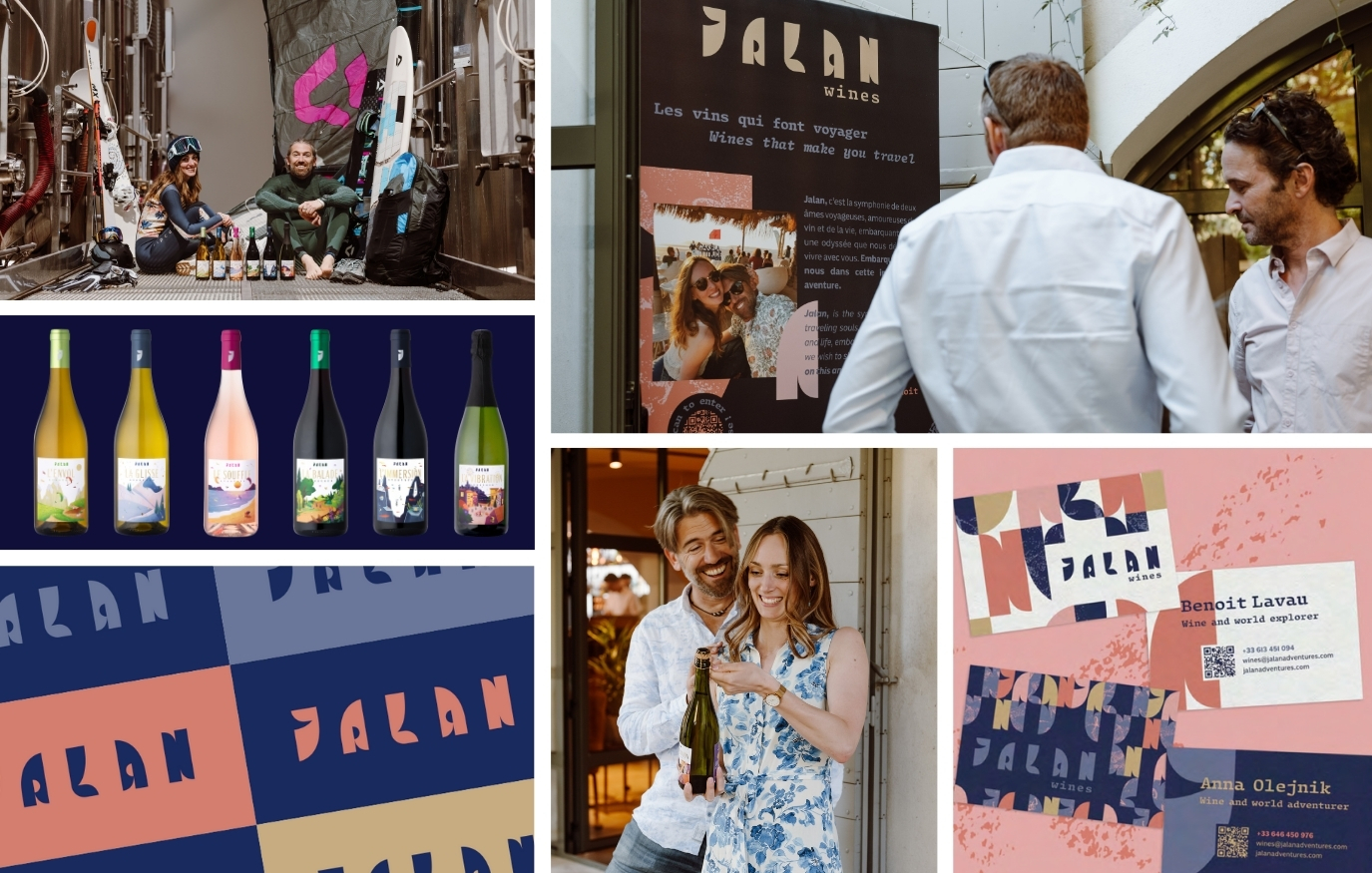
Once that was decided, the path became clear: it had to be about us, it had to be about the journey, the path, and therefore it had to be about our adventures. And there you have it, you already know where the name of our range comes from. That’s when Anna said to me: “What if we used the activities we love to make a complete range? The idea, while original, had one great advantage: it would be easy to communicate using our images, our travels and our experiences. The other benefit, which took a few minutes to emerge, was that wine is about sensations, and our outdoor sports are also about sensations. So we created bridges between these sensations from distant worlds:
- The freshness of the wind while paragliding evokes the acidity and freshness of white wine.
- The sensation of gliding on powder snow conveys the creaminess.
- The density of scuba diving recalls the concentration of red wine.
- The vibration of music embodies effervescence.
Wine sensations are subjective, so why not give them a physical, almost corporeal, representation, so that we can better understand what we’re feeling?
The names were more obvious, though not easy: they had to be short, give meaning to the wine and represent the activity we’d chosen:
- L’Envol (taking off) for freshness
- La Glisse (the glide) for smoothness
- Le Souffle (the blowing of the wind) for vivacity
- La Balade (the stroll) for fruitiness
- L’Immersion for concentration
- La Vibration for effervescence
We then approached the graphic designers at Coup de Foudres. Olivier and Thibaut are based in Marseille and had worked with Anna in the past. After a few weeks’ work, they came back to us with several logo presentations, visual identities and creative concepts. Naturally, we went for the boldest one, with its distinctive lettering, warm colors and modern typography. Jalan, wines that make you travel, was born.
Next came the label design, for which they proposed three approaches: digital collage, creating a patchwork of images for each cuvée; illustrative fresco, with stylized drawings; and postcard, which was obviously in keeping with the travel theme, but we were immediately won over by the stylized drawings, which enabled us to create a world that was both dreamlike and truly representative of the cuvées and sporting experiences.
Between the idea of creating a brand together and the printing of the first labels, it took us almost six months of work, creations, head-scratching and discussions with graphic designers to get the mock-ups to our printer, Autajon Méditerranée. Six long months of work on top of our other jobs to finally see the reels printed with all their pretty colors and all the hopes they carry. It was finally time to go and present the wines for the first time in their beautiful packaging at the WineParis 2024 trade show in February.
Once again, what an Adventure…
